Sloppy Duck Saloon Rebrand
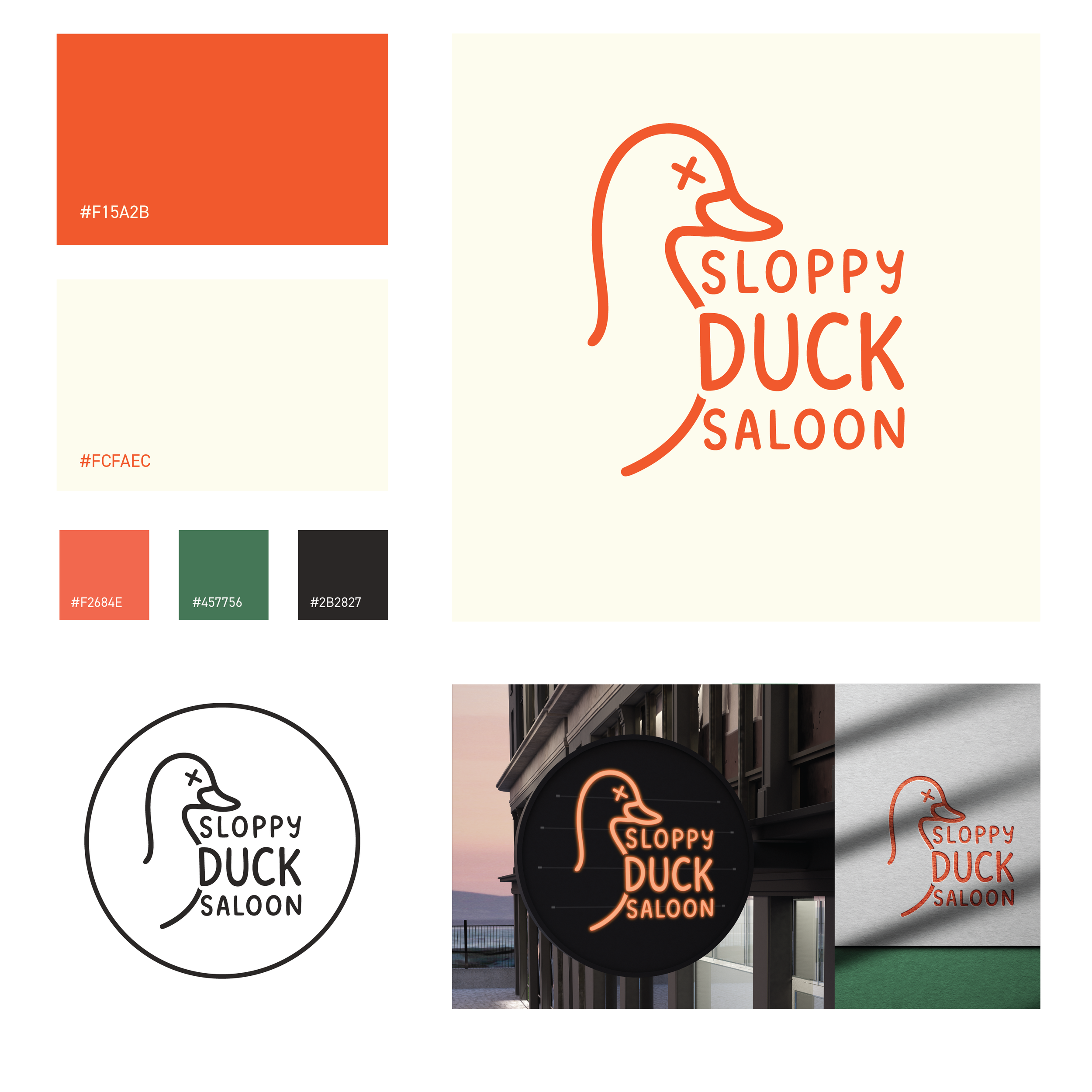
Sloppy Duck is a conceptual rebrand of a local restaurant created as a personal design exercise focused on simplification, personality, and brand clarity.
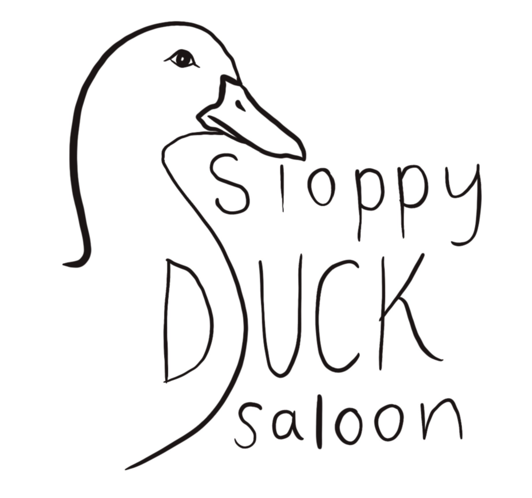
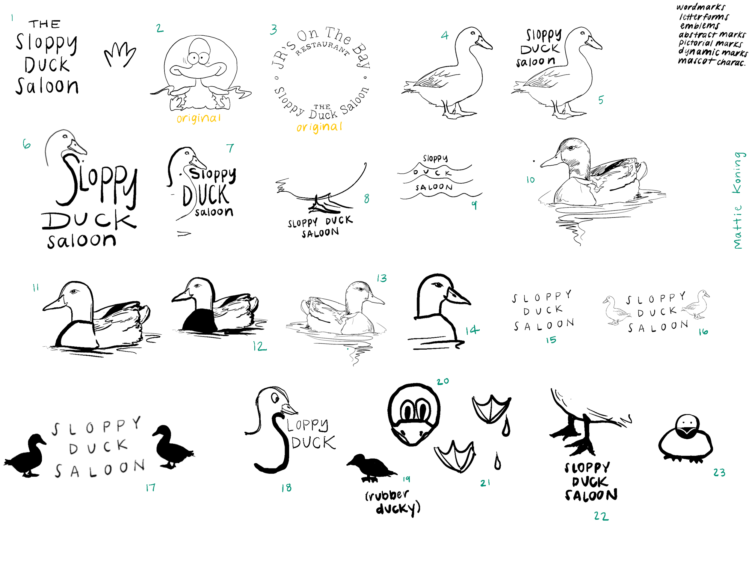
The original identity relied heavily on excessive typography, outlined forms, and complex visual elements that reduced legibility and cohesion. This redesign streamlines the brand into a more approachable and memorable system centered around a clean line-art illustration style and custom typography.
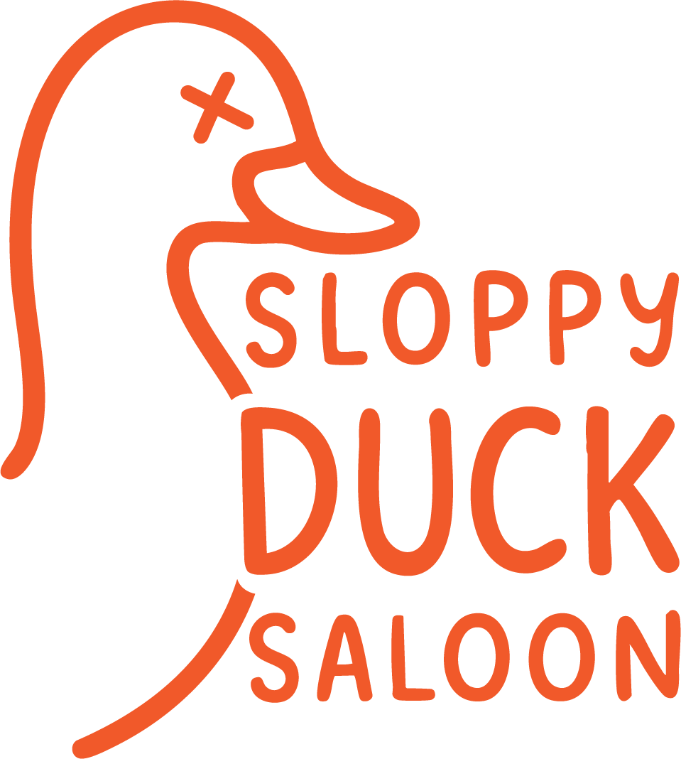
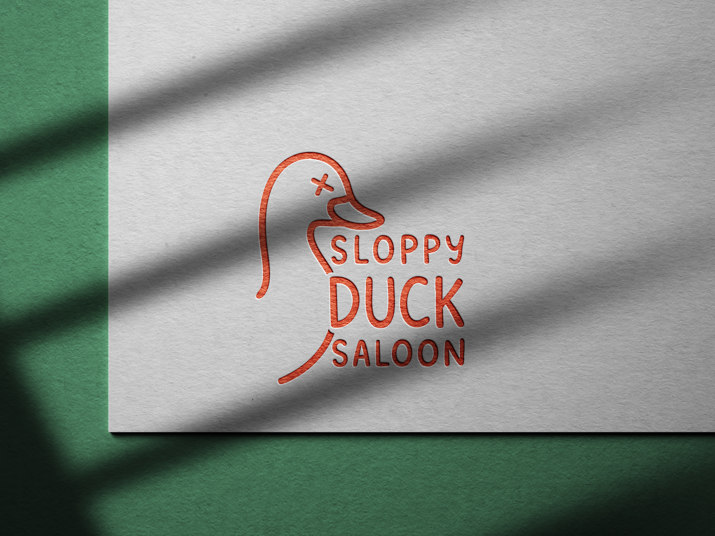
The updated logo features a playful duck icon paired with simplified “Sloppy Duck Saloon” lettering, unified through consistent line weight and a comic-inspired yet modern aesthetic. An orange element and the duck’s stylized “x” eye reinforce the laid-back, drunken saloon atmosphere while maintaining a friendly and welcoming tone. The project explores how reduction and visual consistency can preserve a brand’s character while creating a more contemporary and recognizable identity.
Branding | Fall 2025
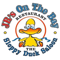
Existing/ Previous Logo